While designing Mya, a mixed-use development in Salt Lake City, Utah, architect EskewDumezRipple had to adapt and integrate three different facades serving different purposes to respond to an odd-shaped lot.
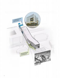
For the project, Fortis Structural and PVE, Inc. provided the engineering services and ZAR developed wayfinding design. The building covers 12,077 m2 (130,000 sf) of a narrow and long lot site. The key challenge was to house a commercial area consisting of a coworking and collaboration space for entrepreneurs and small businesses, a retail area, and a residential portion on this odd-shaped location.

While a mediocre, and aesthetically disjointed solution would have utilized the space as one whole, the design team instead decided to divide the layout to accommodate the three distinct functions. In doing so, the facade was articulated differently and built to feature three different entrances, one for the coworking office space, The Shop SLC, one for the residential units, and the third for the retail portion.

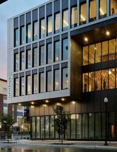
At the ground level, the glazed facade of the retail space is designed to allow passersby a view into the retail outlets. Recessed from the rest of the exterior, it also clears a pathway for pedestrian access. Immediately above, facing the most heavily trafficked intersection bordering the building, a carved aperture on the facade frames the two main areas of coworking for The Shop SLC. On the neighboring face, a similar aperture showcases a central communicating stair running from the second to third floor of the coworking area, creating a vibrant window into the activity occurring within.
As the eye traverses the building from front to back, it almost dances over several serrations in the facades that signify the transition from retail and workplace to residential. The rear facade of the building enclosing the residential area features an artwork from a notable local artist.

Interestingly, the construction of the building transitions from steel and concrete framing in the commercial portion to traditional stick framing in the residential portion—which resulted in significant cost savings than would have been possible with complete reliance on light gauge steel. The eyes similarly dance over the windows, which advance from the rigor of crisp edges prevalent in the retail and workplace area to larger, more expansive openings appropriate for the residential units.


Responses